(click on charts for full view)
Here is the Update:
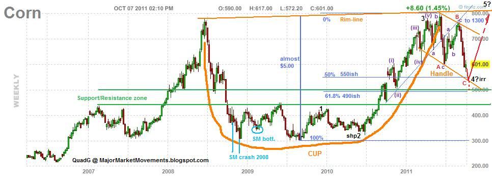
The end of wave C red of 4 black may be finished soon near the 50% to 61.8% retrace level just above the multi-year S/R zone. If however, Corn continues to slide below the S/R zone, then this CnH pattern is likely dead.
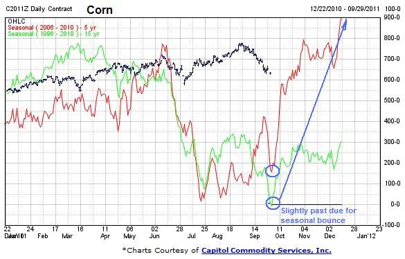
The seasonals suggest that a low is close and a bit over due:
Soybeans - The recent thrust higher failed at the mid-fork of the previous up channel (green), failures at the mid-fork often suggests that the channel is likely to be broken, and it did:
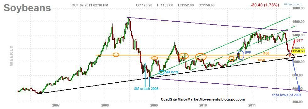
A S/R zone is present between 1050 and 1100, as well as a multi-year uptrend line (black). This should lend plenty of support for at least a bounce up to back test the previous channel at a minimum. If however the black trend-line breaks (blue projection) then capitulation has likely set in and a larger C wave down to the 600s is possible.
The seasonals, like corn, suggest that a bounce is possible soon, if a bit over due:

Wheat - I think the conclusion of a wave 2 black correction could be seen soon. The pattern looks like a possible 3-3-5 expanded flat. It should conclude soon above the lower-green channel line, 61.8% fibo retrace level and the support/resistance area (orange):
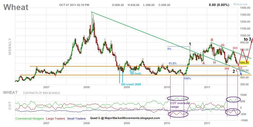
If this level provides support, then a bounce back up to the mid-700s to 800 seems probable, possibly the right neck of a bullish iHnS. The COT levels are entering an oversold area. If however, the price of wheat falls below the lower-green channel line (blue projection), then the 400 level is likely to be tested along with further downside if the previous green channel becomes resistance instead of support.
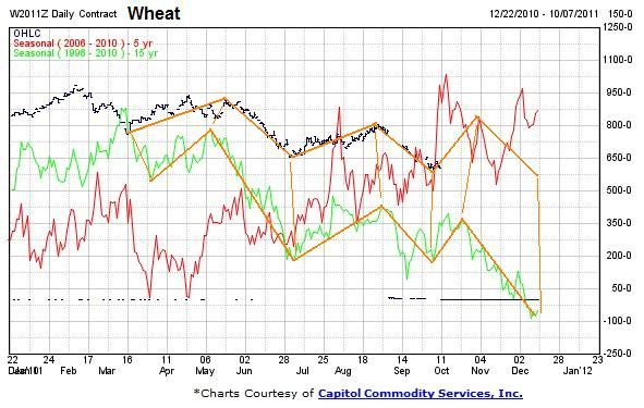
The seasonal chart suggests a minor up swing is possible soon into November, but further weakness expected into the end of the year:
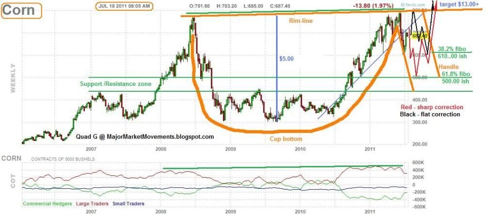
Also note the pale blue areas of each chart. The bracket shows where the worst of the 2008 Stock Market (SM) dump occurred. Notice how the grains barely moved in comparison. The pale blue circle was near the end of the SM decline in March 2009, yet the grains put in higher-lows.
...